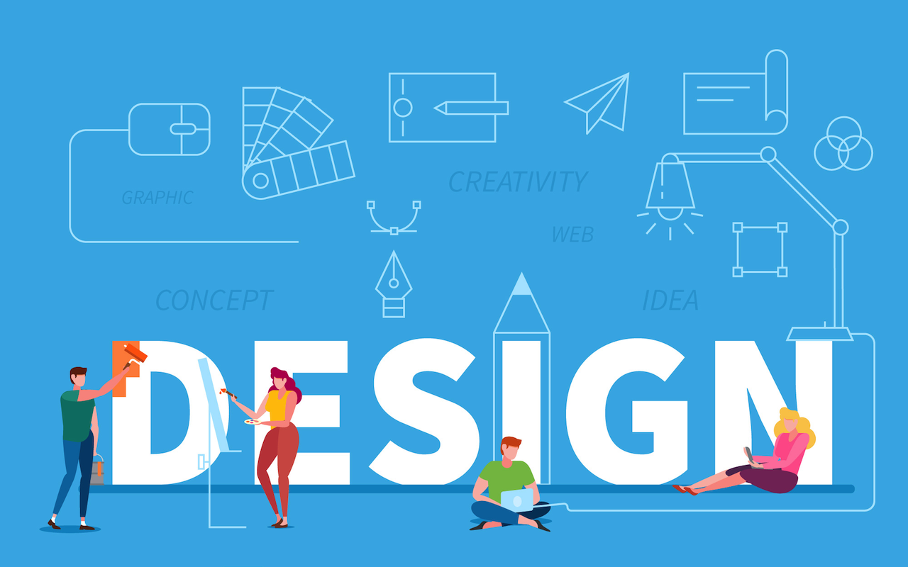
You have ten seconds. That's the window for your interface to make its first impression, and during those critical moments, users form judgments based almost entirely on what they see. Research shows that 94% of first impressions are design-related, determining if someone stays engaged or clicks away.
Visual consistency acts as the silent architect of that first impression, creating an immediate sense of reliability that users feel before they can consciously articulate why. When design elements align across every interaction point—when buttons look and behave the same way, when colors carry consistent meaning, when spacing follows predictable patterns—users sense they're in capable hands. When elements clash or shift unpredictably, confusion sets in just as quickly.

The Recognition Factor
Brand recognition doesn't happen by accident, and the path to memorability runs directly through consistency. Studies reveal that using a consistent color palette alone can boost recognition by up to 80%, which matters because recognition serves as the gateway to trust, and trust drives engagement. Users need to encounter your brand 5-7 times before they truly remember it, turning every interaction into either a reinforcement of your visual identity or a confusing reset. Think about the interfaces you use daily—you recognize them instantly because their visual signatures remain stable, with the same button styles, color palettes, and spacing creating visual fluency that feels effortless to navigate.
This fluency operates largely below conscious awareness, which makes its disruption particularly damaging. When visual elements shift between screens, users must mentally relearn patterns they thought they'd mastered, creating cognitive taxation that manifests as vague discomfort and translates directly into reduced engagement.
Building Trust Through Predictability
Trust emerges from met expectations, and visual consistency serves as the foundation for those expectations across digital experiences. When users click a button styled one way on page one, they naturally expect similarly styled buttons on page two to behave the same way, and when that expectation proves correct repeatedly, trust compounds with each validated interaction. Companies maintaining consistent branding across all platforms experience up to 23% revenue increases because users who trust an interface explore more deeply, try additional features without hesitation, and return more frequently.
The connection between visual consistency and user confidence runs deeper than surface-level aesthetics, which explains why professional UI design services focus so intensely on creating robust design systems. Systematic consistency enables users to transfer knowledge across contexts automatically, so once someone learns how your primary buttons work, they apply that knowledge everywhere else without conscious thought, substantially reducing the activation energy required for engagement and removing the friction that causes users to hesitate when faced with unfamiliar patterns.
The Mechanics of Visual Harmony
Visual consistency operates across multiple dimensions that work together to create a coherent language users can read fluently. Color creates emotional tone and guides attention, typography establishes clear hierarchy, and spacing determines how elements relate to each other. When these elements align systematically, they form a visual vocabulary that users internalize rapidly and apply unconsciously as they navigate.
Consider navigation elements: place your logo in the top left corner, and users instantly know they can click it to return home because this pattern exists across thousands of interfaces they've encountered previously. Deviate from this convention, and you force users to hunt for functionality that should be automatic. The same principle applies throughout—hover states should highlight consistently, loading indicators shouldn't jump between positions, and these micro-inconsistencies accumulate into an interface that feels fundamentally unstable.
The Data Feedback Loop
Engagement metrics often reveal consistency problems long before user complaints surface, manifesting as drops in time-on-page and declining completion rates that trace back to visual inconsistencies creating friction. Track where users hesitate, and you'll often discover they pause before interacting with elements that look different from patterns they've learned elsewhere, revealing uncertainty about familiar rules. Analytics expose patterns that design reviews miss—if button A consistently receives more clicks than button B despite B serving more important functions, styling differences might explain the disparity entirely, since users interact more confidently with elements matching established patterns.
Beyond the First Screen
Consistency matters most as users deepen their engagement, because while first-time visitors might forgive minor visual quirks, retention depends entirely on the experience feeling reliably stable across sessions. This becomes especially critical for complex products where enterprise software with hundreds of screens requires ruthless visual consistency because users navigate primarily through pattern recognition, letting them confidently apply learning from one module to another. Mobile contexts amplify these requirements because limited screen space makes pattern recognition absolutely essential for orientation—if your interface shifts visual vocabulary between screens, mobile users lose their bearings far more easily.
Implementation Requires Discipline
Maintaining visual consistency demands systematic approaches that extend beyond individual talent, requiring organizations to document decisions about colors, typography, spacing, and components in design systems. These systems serve as both reference and constraint, ensuring new features align with established conventions. Style guides capture these decisions but require active maintenance as products evolve, making regular audits essential for identifying divergence. Component libraries enforce consistency at the implementation level, making correct behavior the path of least resistance so visual consistency emerges automatically as developers build features using pre-defined components.
Consistency Enables Evolution
Strong visual consistency makes evolution easier rather than harder, because when users trust your core patterns deeply, you can introduce new features without requiring extensive re-learning. The new functionality fits within the established visual vocabulary, letting users focus entirely on what's genuinely different. This foundation also makes testing more effective by ensuring consistent baseline implementation isolates the specific variable you're testing.
Companies achieving up to 33% revenue increases through consistent branding accomplish this by evolving continuously while maintaining core visual principles. Their design systems grow as new requirements emerge, but each change considers how it integrates with existing patterns. Visual consistency channels creativity productively by shifting the question from "what should this look like?" to "how does this fit our established visual language?" This constraint accelerates decision-making by eliminating debates about arbitrary preferences.
Users reward consistency with engagement because consistency reduces friction between intention and action, letting them spend less mental energy figuring out how things work and more energy accomplishing their goals. That shift from learning mode to doing mode marks the crucial difference between shallow interaction and deep engagement.
Featured Image by Freepik.
Share this post
Leave a comment
All comments are moderated. Spammy and bot submitted comments are deleted. Please submit the comments that are helpful to others, and we'll approve your comments. A comment that includes outbound link will only be approved if the content is relevant to the topic, and has some value to our readers.
Comments (0)
No comment